
We decided to renew our Refrival Brand identity, to show the evolution of the company based on our pillar: Innovation, Sustainability and of course, our best asset Our People
We focus on the word REFRIVAL, with a much more modern and unique typography. This change reinforces our identity through several symbols and signs you may discover inside the logo:
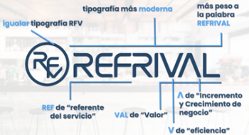
- ꓥ stands for the “increase icon” referred to how Refrival helps the develpment of our clients
- V stands for the “decrease icon” referred to the eficiency generation we look for as a key objective and methodology
- REF stands for the “Reference Service Company” in Refrival we always have targetted for
- VAL stands for the “Value Generation” we give in all projects we develop with and for our clients
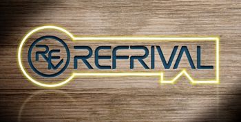
Finally, the global view of the Refrival new image and logo seems to form the shape ok a KEY, which leads to our role as Key in the Business Projects, as a partner which “generates value beyond the service”, caused by our company values: Innovation, Commitment, Efficiency, Integrity and Entrepeneurship Spirit
Click here to see all the details
For more info: contact us